
I will be ending this Substack at the end of this year. Substack’s response to the question of Nazi content is weak. They will continue to platform and monetize that kind of material. I will be setting this up elsewhere, though atm you can also find these pieces cross-posted on Tumblr.
Continuing my week of meta-elements which make for great games, I want to talk about physical presentation. There’s a weird mix in my collection of ttrpgs. I have 8-9 shelves filled with physical books and way, way too many accumulated in my badly organized “rpg e-files” folder which has migrated across five different desktops. I’d say pdfs have become the majority at this point. I usually read those on a crappy Samsung tablet, mostly because I have a hard time reading large amounts of text on a screen. So pdfs work better than others– and I appreciate when the designers have thought about these elements.
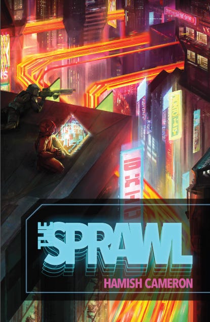
Printer-Friendly: I love it when a ttrpg has a printer friendly mode. This can take a couple of forms. Some games, like The Sprawl, have a day-mode and night-mode versions. When I first saw the Sprawl’s white text on black background, I didn’t like it. Eventually I found out that was a more comfortable approach for a lot of readers. But I appreciated that Hamish Cameron eventually released a version with standard black on white page design. Other games publishers in the last few years have begun to do this more and more. Star Trek Adventures includes that with the pdf purchase.
The other version of printer/reader friendly is to have layers available in the pdf. This allows readers to turn off distracting page elements: paper textures, watermark art, intrusive page frames. This allows for easier printing, but frankly for me, it makes for easier reading. It just makes me unreasonably angry when I get a pdf with page backgrounds that make it harder for my old person's eyes and I can’t turn those off. Sometimes a pdf will have layers but turning off the backgrounds removes the text as well because they’ve merged the two together. The best games have layers, cleanly separated and cleanly labeled.
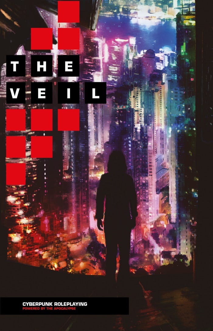
Give Me Text: Some games in recent years have offered text-only versions, like The Veil. I love this. It is hugely useful and makes it more likely that I’m going to run that game. I run the majority of my ttrpgs online. Usually that means I’m putting together materials for the players: setting background, cheat sheets, and character keepers. Extracting text from pdfs is a pain, even with a good program. You almost always have to deal with the paragraph breaks and formatting. When a company provides the text, it makes my job significantly easier. If you want people to play your game online, outside of a set VTT package, include the text with the pdf. A lot of folks on itch.io know to do this.
Accessibility: There are a couple of elements which I can’t speak to from experience, but I appreciate when I hear about publishers who spend the extra time getting these things right. My father was color blind and the few board games he played with us often had to be modified to make up for that. Some companies use online tools to check how their material works for the color blind. That’s important where color is used to mark out important information: particularly different colors to indicate different things.
On the other hand, one complaint I’ve heard about certain books is that they’re particularly dyslexia-unfriendly. They choose fonts which look cool but become a pain to actually read for people with this condition. I know tools and resources exist for checking which fonts work better than others. Of course it isn’t just about fonts, but general typographic elements, size, background bits, etc. When I designed the earlier Gauntlet Community revised logos, I had input from a couple of folks who encouraged me to move clutter away from the words and remove some extra type flourishes. It looked better and became more useful as


